Soupa Soups FMCG Branding and Packaging Design
2022
This brief was for the brand Soupa which sells wholesome pre-made soups for families. This brand provides hearty option for customers and aims to become a known alternative to popular soup brands in the pre-made soup category.

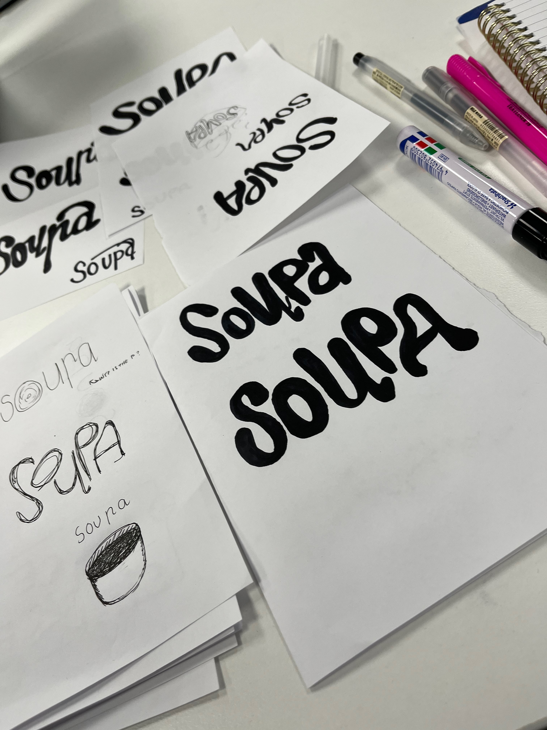
Soupa Logo and original ideation sketch.
The logo is slightly playful but grounded by it thick lines. the fluid motion in the letterforms is reminiscent of the drops of soup left in the bottom of your bowl at the conclusion of your soup dinner.
The playful aspects of the logo is matched with the striking contrast of the harsh lines and shapes in the packaging. This brand provides a series of five flavours of classic soup varieties. Each variety is matched with an individual colour pallet, but each of there packets has the same structure in order to create a sense familiarity
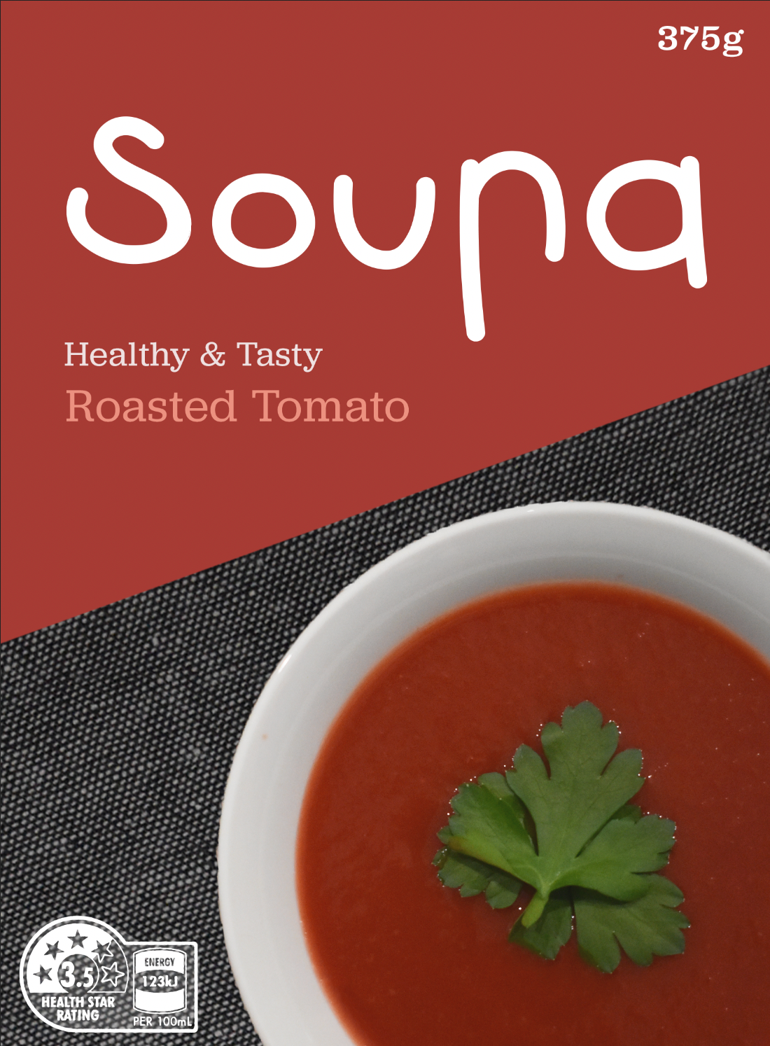
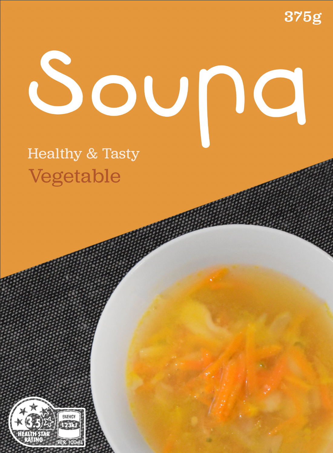
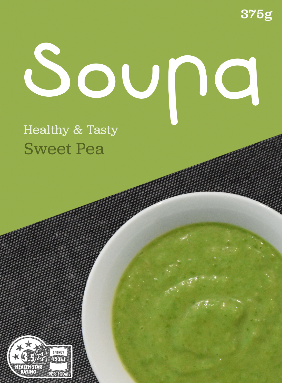
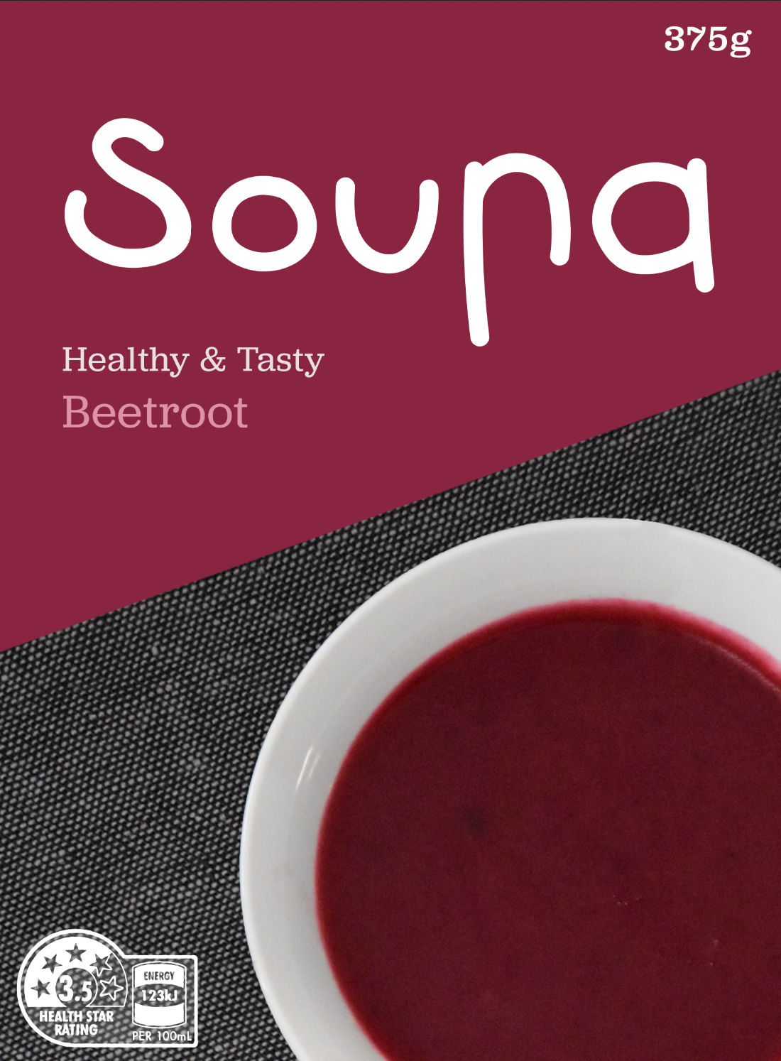
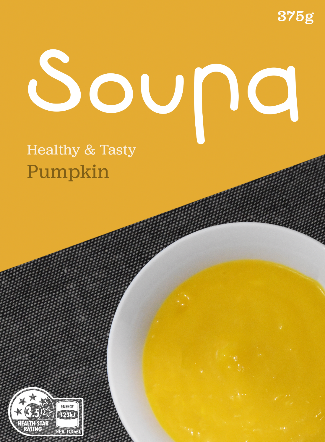
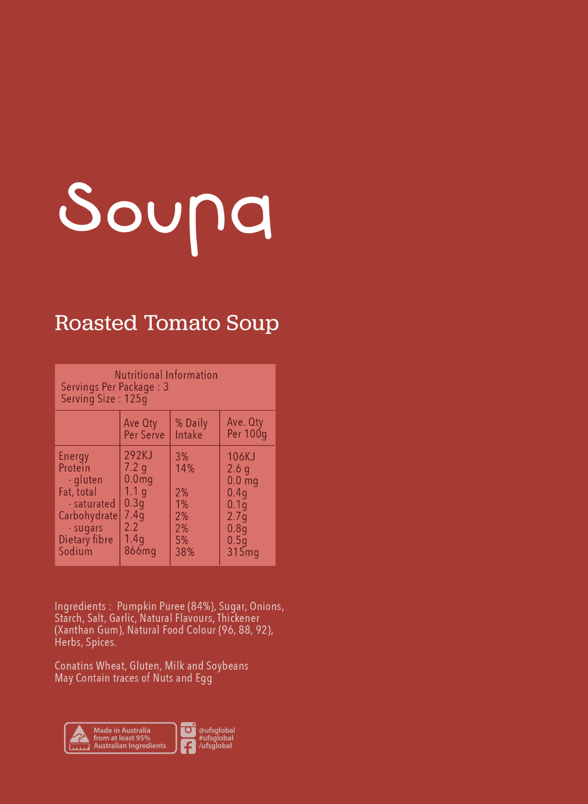
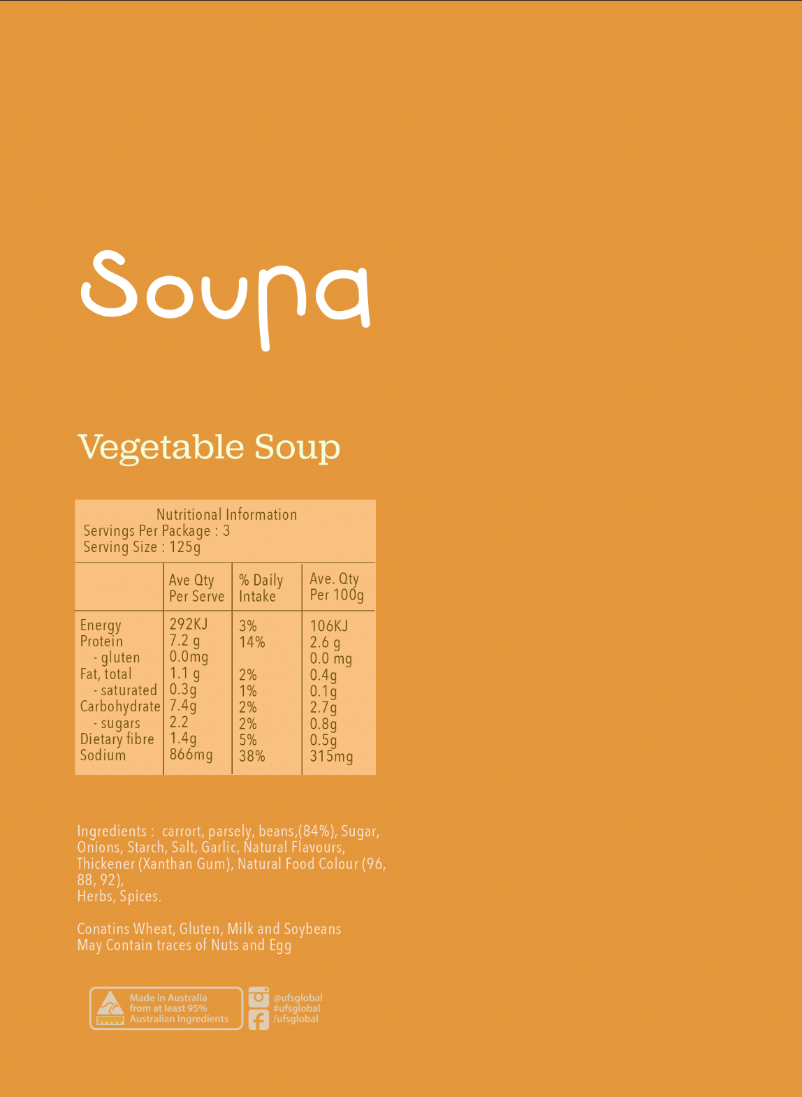
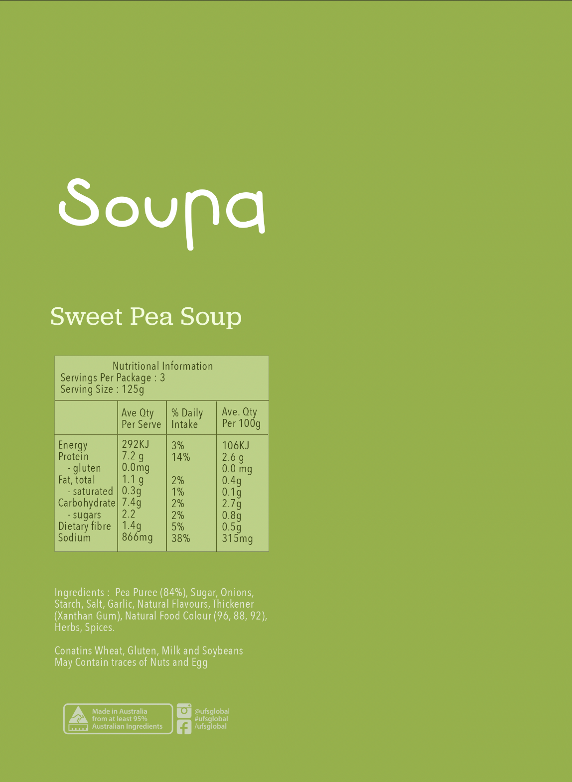
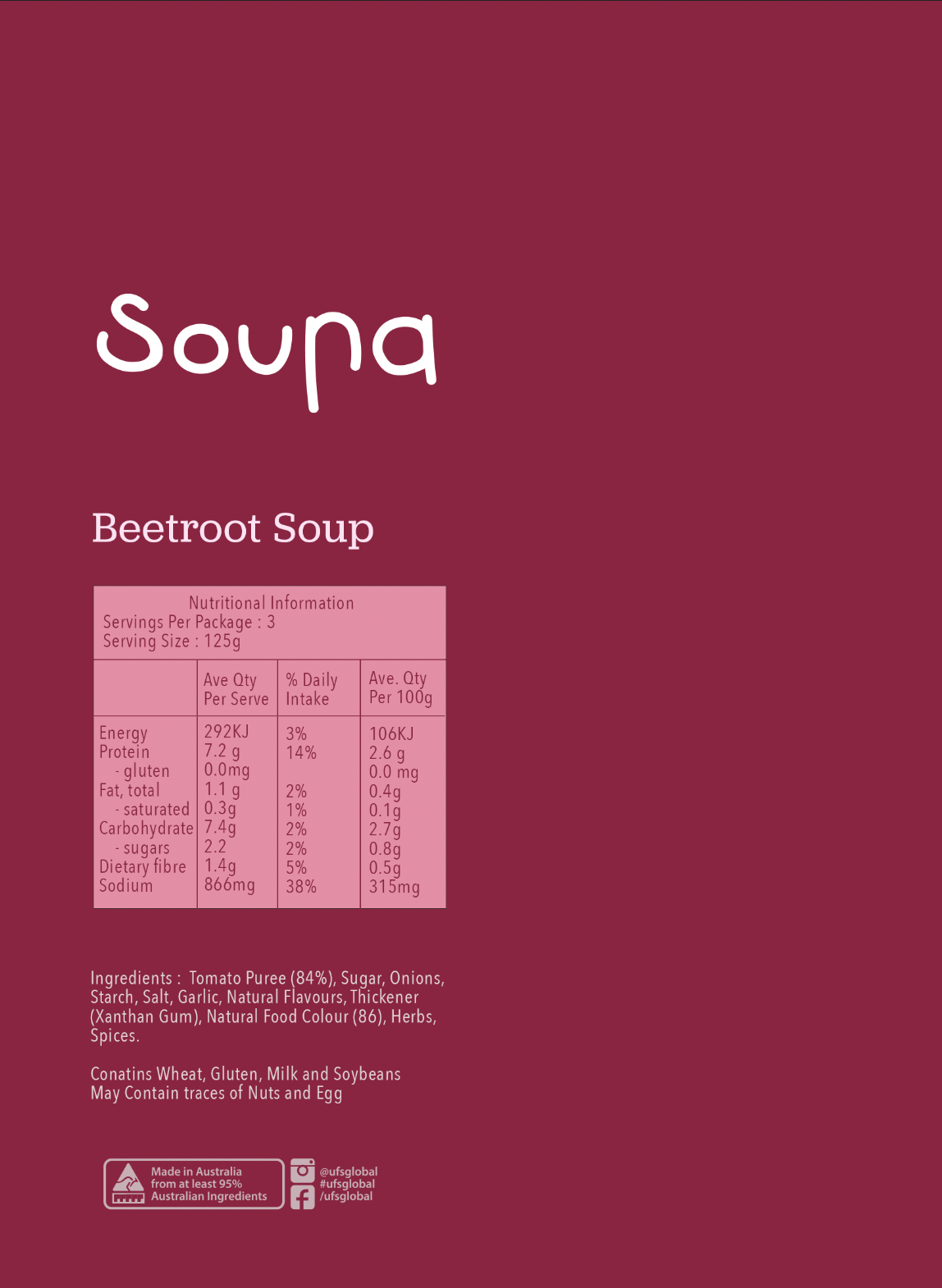
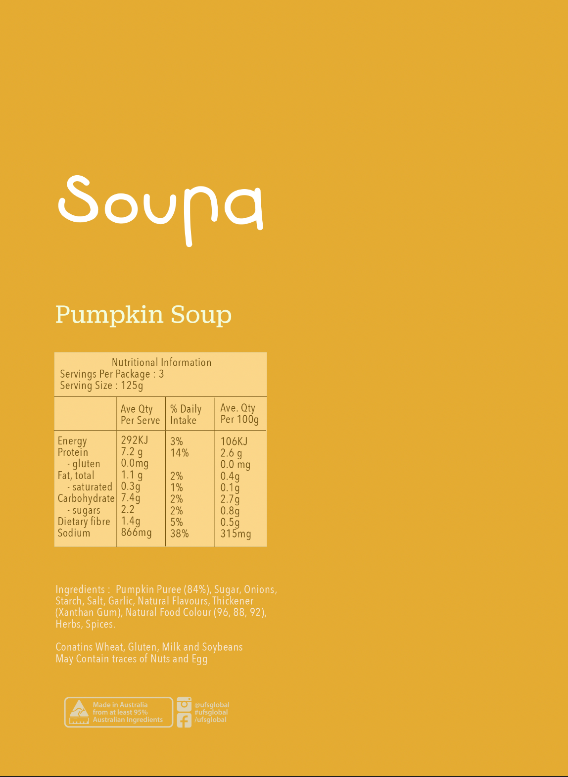
Soupa Range Packaging Surface Designs
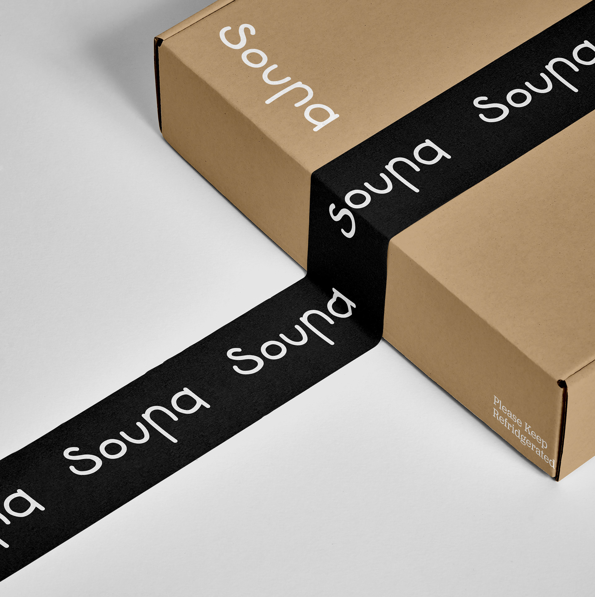
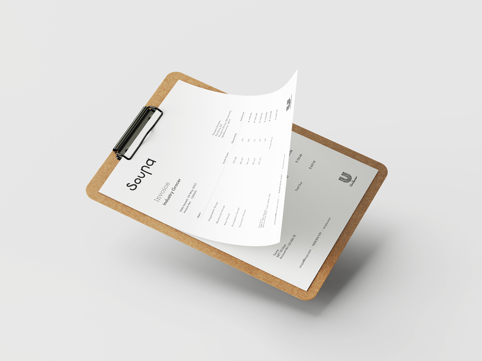
Brand Extensions
Packaging Di-line and Specifications
